
Analytic dashboard for U-Analyze
U-Analyze is an AI-powered conversational analytics platform that is user-centric, harnessing conversational analytics to transform the experiences of both customers and contact center representatives, toward meeting customer needs. It helps to acquire customers and improve efficiency.
Problem
Users need to analyze emotions and behaviors of responses for both customer and agent in the interaction in order to reduce agent burnout and improve the customer’s experience.
Improve speech metrics offered to the customer on the interaction details page to identify actionable key moments.
Solution
Utilizing Behavioral Signals API to surface a range of emotions and behaviors in the audio player and show high-level user analytics within the U-Analyze Interaction Details page for Quality Analyst and Business Analyst personas.
Team
Sivadharsan Sellathurai (Dev. Lead)
Jeff Karas (PM)
James Joseph (PM)
Role
Product designer
Time
Mar - Now
Research
Initial Research
With the product owners, we found 4 sponsor users representing 4 of our main personas and conducted interviews with them.
Quality Management
Business Management
Supervisor
Agent
User Persona
For this project, I’m presenting you - Quality Management (QA)
User Interviews
Primary User: Quality Analyst - Tasha 👩🏼🦰
Participants responded to the following questions:
What is your day-to-day workflow as a QA?
What dashboard experience would you normally expect to see?
Would you, or would you not expect to interact with other roles in order to achieve your goals as a QA?
User Story
As a QA, I need to be able to identify key moments from configured business rules so that I can provide actionable insights to improve agent performance.
As a QA, when I switch between the different types of scores I want the system to give me a new set of detected business rules, key phrases, and sentiment (negative, positive) that matches the parameters of the selected type without any further input from me.
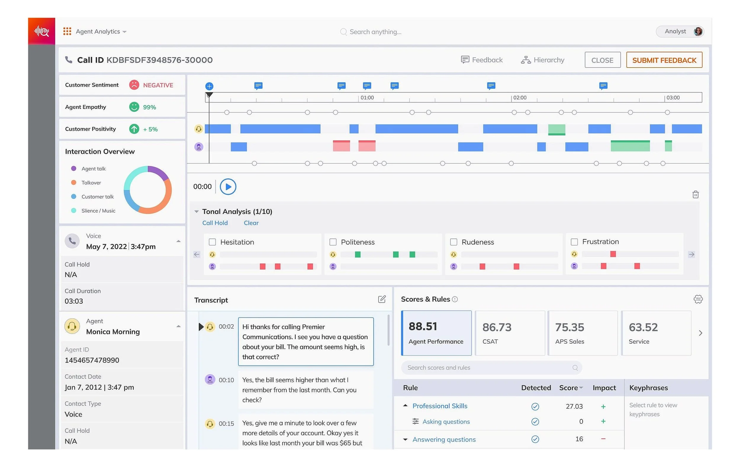
As a QA, when the interaction analysis loads I want to see metadata that gives me basic context for the interaction (score, agent, customer, when, where, overall sentiment) before I audit it, however, I also need a place to dig into more metadata, if needed.
As a QA, I want to view a breakdown of business rules that have the most impact on the overall score, whether positive or negative, so I can save time by focusing only on configured business rules that are in-score.
As a QA, I want the default in-score business rules to stand out in the playback, show the business rule, and, once clicked, jump the indicator to the selected mark where I can view the key phrases, in order to surface the most actionable insights so I don’t waste time reviewing sections of the interaction that have no insights.
As a QA, I want to see the overall sentiment for the agent and customer, which can be shown or hidden, in both the playback and transcript, to direct me to specific sections I should review so that I don’t waste time reviewing sections that have no insights.
As a QA, I want to make a note of which business rules were missed in the score so that the BA can make changes to the configured business rules in order that the analyzer makes fewer mistakes.
As a QA, I want to show and hide filters for business rules, agent and customer sentiment (negative, positive), and key phrases in transcript and call events so that I can remove visual noise and hone in on high-priority sections.
Insights

Concept
Feature Ideation
In addition to direct user insights, I queried fellow designers to ideate potential dashboard experience ideas. Moreover, I took initiative to a market parity research based on competitive analysis, in order to nail down the total of promising features.


Workshop
After synthesizing the research and interview findings, we then made ample preparations for remote workshop sessions. Along with Sivadharsan Sellathurai, Jeff Karas, and James Joseph, we facilitated an efficient workshop that had a high attendance rate of internal stakeholders that included architects, development, and product management. On the first day, our team hosted a knowledge share of our work:
Research playback
Competitive analysis
Search best practices
After we reconvened for a following session, we immediately gained alignment and agreement on the roadmap priorities, the definition of dependencies, and measurable goals for analytics.
After assessing each one in relation to user need statements, our design team decided to use 26 of them for to find out what feature/functionality users wanted and expected. In conjunction with the research requirements, I rendered visual assets to complement the workshop experience.

User Diagram
Our research enabled us to map out the user experience by creating a user diagram that identifies key activities users engage in on our website. With this information, we can plan how users navigate our website and ensure they have everything they need to maximize their experience.
Using the user diagram, we pinpointed important features such as personalized recommendations, intuitive search functions, and visually appealing content. We also identified areas where users may require extra assistance and developed resources such as tutorials and FAQs to assist them.
The user diagram is essential in creating a successful website that is user-friendly and enjoyable for our users. It allows us to concentrate on what is most important.

Design
low-fi
I used low-fi wireframes concepts to present to follow-up users in RITE testing. These workflows included boolean operation, filtering functionality, and scoped search.

Mid-level
We increased both content and visual fidelity to mid-level for optimized testing with users.

Hi-fi
After frequent communication with my users, PM team, and dev team, I was able to move to hi-fi smoothly.

Iterations
Despite initial setbacks, we continuously sought to improve our solutions through trial and error, user and stakeholder feedback, data analysis, and other techniques. This iterative approach allowed us to refine the usability of our products and ultimately make them user-friendly for everyone. We extend this same principle of iteration to all our systems, not just our products. We regularly review our processes to ensure their efficiency and effectiveness.

Prototype
Project Management
Agile Development
I worked closely with our project managers and dev. lead to writing out user stories for the development team to work on in 2 week sprints.
Mid-sprint check-ins were very valuable for design and dev to collaborate and make necessary changes to get closer to closing all open issues.

Reflections
What did I learn?
I learned a great deal about managing multiple stakeholders’ relationships, creating design-led innovations based on user research, adapting priorities to various constraints, and aligning UX design to direct business goals.
What would I change?
I would have liked to invest more interaction explorations into the filtering functionality so that it would be less clunky and overwhelming to the user. The number of available filtering options far exceeded my initial expectations so I think there's ample opportunity to figure out how to make it more user-friendly. Secondly, I’m not a big fan of the color palette we are using right now, that’s why building a design system is extra exciting.